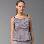
Marc Jacobs is the only man who understands me!
 While I'm certainly not a neat freak, I'm not terribly messy either, so perhaps it's odd that I like all my clothing to look as though they're just a little unclean. No, that's not the best way to say it; I mean, I hate laundry, but I do it pretty often anyway. What I actually mean is that I like my colors to look muted, as though they were covered with just a thin layer of dust. So it's no surprise that I gravitate toward gray, black, camel, dirty-wash denim, and the occasional bit of mauve or dusty rose as well.
  It's not that I don't like color. I love it. Spending an afternoon at MoMA or the Whitney or something really is my idea of a good time. It's just that, with my clothes, I don't want color to wash me out. While I will occasionally wear bright blues or purples (I have blue eyes, so blues and blue tones pick up on them rather than wash me out--but I still love dusty blues and periwinkles), most other bright colors look kind of overwhelming on me. If I absolutely must have bright item of clothing, I'll pair it with something as dark and muted-looking as possible, and I'll like it more when it's faded (I have an ancient green J. Crew tissue tee that I love to death, which is ironic, since it's probably about to die). I've pretty much stopped buying brights, since I know I won't wear them much.
 The designer who seems to best understand my color quandary is Marc Jacobs (is there anything this man can't do?). I mean, I need to keep buying color, since I don't want to subscribe to black only like it's a Maoist uniform like everyone else in New York does. His colors are never garish or annoying or unflattering, and even though his clothes don't look vintage or ratty, they usually do look like they have some sort of story. They look faded, or worn, or loved, or something. Take the red dress. It's red. No dumbass would deny it's red. But it's not traffic light, in-your-face abrasive red. It's just nice, slightly washed-out red. Much better than stop-sign red. His use of slightly (but only ever so slightly) toned-down color and soft, brushed-feeling fabric makes his clothes better than real vintage. Today, I tried on a pair of olive pin-striped Marc Jacobs pants, and the color was sublime (the pants were too big, though). I also tried on a lilac (dusty lilac, I should say) slouchy Marc sweater (slouchy because it was way too big too, but tops are a lot more forgiving than pants), and while I don't exactly need sweaters going into spring, I couldn't resist it.
Now if only I could afford to buy all the rest of my clothes from Marc Jacobs, too. Sigh. Maybe Marc'll jump on the bandwagon and do a line for Target. Well, a girl can dream.


0 Comments:
Post a Comment
<< Home